"Does this go?" I see this post a lot in sewing forums as seamstresses are laying out choices for their next project. Choosing fabrics for your sewing project can be delightful as being a kid in a candy store, or frustrating as putting together a puzzle with pieces that just won't fit. What fabrics go together? Which colors look nice alongside each other? How many
prints or colors is too many? What size print should you choose? Do you
stay safely with one designer's line of fabric or do you mix them up?
Where do you even start?
I feel like choosing fabrics should be the most fun part of the whole creative process but sometimes I get bogged down asking myself questions like these. So I "talked" with a few of my favorite childrenswear designers and they graciously agreed to share their expertise on choosing great fabrics for a child's garment. Today we talk with Ashley at Chickadee Chickadee and Michelle at Hypernoodle Fabrics. Be sure to read all the way to the end for a treat from Michelle! Hint: Did I mention she runs an online fabric shop?
I am a huge fan the fresh, all-girl style I see over at Chickadee Chickadee. It's playful, it's colorful, and the twirly dresses and ruffly skirts always maintain a sense of balance. Here is what Ashley had to say on the subject of choosing fabrics for her designs:
Freshly
released patterns also capture my attention and when I purchase a new
one, often I feverishly look through my fabrics to find something
suitable to test out the new design and watch it come together right
away. I
generally start by selecting a fabric that I want to become the focal
point of the item. If the main print is big and bold, I select
complementary prints for sashes, sleeves, skirt banding, etc. that are
more subdued and smaller in repeat. Sometimes my focal fabric will be
the bodice, other times the skirt.
 For this dress, the knit bodice is
very loud and colorful, so I wanted the rest of the piece to be quieter
and more predictable. I
chose tone on tone dots and tiny circles that wouldn’t distract from
the bodice for the prints that would be positioned closest to the
colorful knit. I didn’t want anything super noisy for the trim on the
dress, so I matched an aqua knit with the houndstooth that gives some
character to the bottom of the dress but doesn’t take away from the
happiness of the top portion. Sometimes I combine fabrics by thinking
about the main print and its characteristics and what it means or what
other images it conjures up in real life.
For this dress, the knit bodice is
very loud and colorful, so I wanted the rest of the piece to be quieter
and more predictable. I
chose tone on tone dots and tiny circles that wouldn’t distract from
the bodice for the prints that would be positioned closest to the
colorful knit. I didn’t want anything super noisy for the trim on the
dress, so I matched an aqua knit with the houndstooth that gives some
character to the bottom of the dress but doesn’t take away from the
happiness of the top portion. Sometimes I combine fabrics by thinking
about the main print and its characteristics and what it means or what
other images it conjures up in real life.

For this dress, I selected the cherries first and then thought about that delicious summer fruit, and then instantly things like picnics (red/pink check fabric) and ants (black and white sash print) came to mind--from there it was pretty simple to bring it all together. Often I am often drawn to opposites or contrasts when it comes to fabric combining.

The main print in this dress is of course masculine. So I thought that feminizing it by bringing in soft pinks and girly prints would be really fun.

I hope these little “recipes” that I use might help you choose wonderful prints and use them together in fun ways! This all might be just my method to this madness that is sewing and designing, though! Either way, it is great fun to chat about fabrics and patterns!!
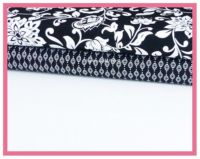
When choosing fabrics to go together, I typically start with a manufacturer’s collection or “line” of fabrics. It’s a quick, easy and reliable way to coordinate! Here’s an example of matching coordinates with a manufacturer’s line:
 But I’m a “think outside of the box” kind of gal and I don’t
always stay within a line of fabrics.
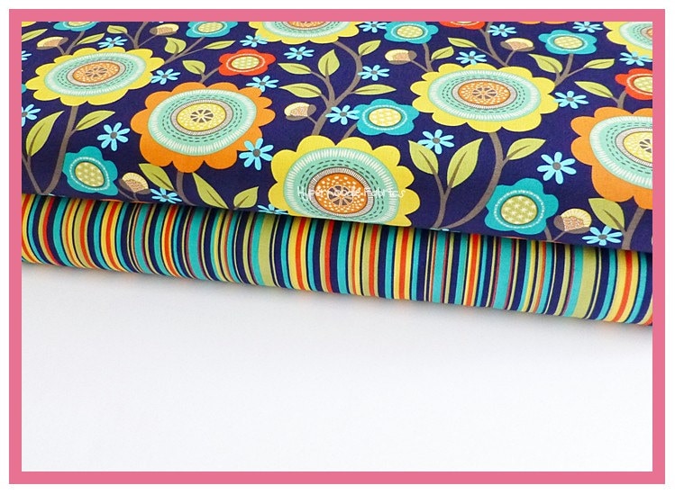
Sometimes the best coordinates may be from the same manufacturer, but
are from different lines, like this:
But I’m a “think outside of the box” kind of gal and I don’t
always stay within a line of fabrics.
Sometimes the best coordinates may be from the same manufacturer, but
are from different lines, like this:
or this:
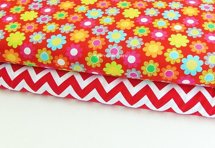
 And going even further, sometimes two fabrics from two
completely different manufacturers can be simply amazing-like this:
And going even further, sometimes two fabrics from two
completely different manufacturers can be simply amazing-like this:
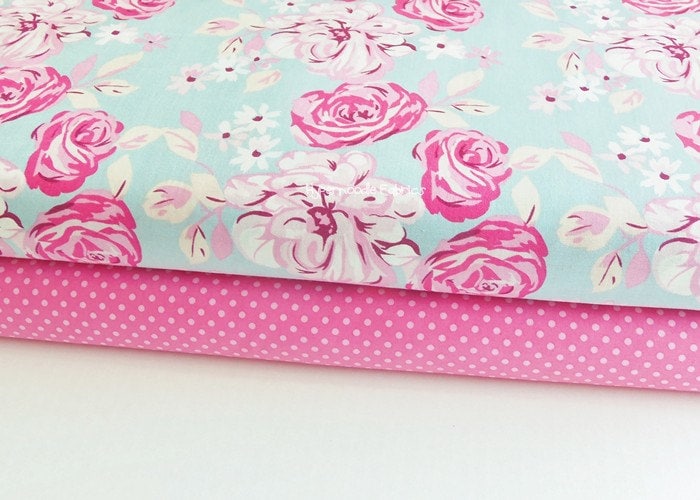
For the most part, I stay in the same color story but also like to go to the opposite end of the color wheel. Sometimes it is great to go all the way to the left with a look that is vibrant, contrasting and fun. In general, unless you’re doing a quilt or some type of patchwork, it is best not to use more than 4 prints. It can look too busy and muddled, especially on a garment. If you find you want to use more than 4 prints it can still be ok, just make sure the scale and pattern of the print don't cause an eye sore. Throw a solid into the mix! It can easily “ground” a group of fabrics for that perfect combination.
Don’t be afraid to play with your fabrics and mix combinations: paisley and stripes, floral and geometric, dots and chevron! Print size really depends on the scale of your project, so keep in mind the size of the item your making when looking at small, medium or large scale prints. Mixing scale is another great way to give your item depth and interest.
The last piece of advice I have is to really look at the coordinating fabrics in a line. The coordinates are considered secondary prints to the main print in a collection, but take a good hard look at them…sometimes they are *better* than the main prints! So don’t overlook them as red-headed stepchildren! If you pull out a coordinate from a line and pair it wisely and originally, you will have a one-of-a-kind, eye catching look that hasn’t been seen before! Happy Sewing!
Michelle is graciously giving Tie Dye Diva blog readers 10% off any order with code FABMATCH and, for any order of $50.00 or more, code BUNDLE for 15% off PLUS Free shipping on US Orders! Go shop at www.hypernoodlefabrics.com but hurry, coupon codes expire Friday 5/24/13.
Thank you to Ashley and Michelle for sharing your inspiration! Now don't you want to go dig in your stash right now? I know I do. Stay tuned for Part 2 coming soon from Fluffy Girl Boutique and KPea Original!
[Go to Part 2 here]

I feel like choosing fabrics should be the most fun part of the whole creative process but sometimes I get bogged down asking myself questions like these. So I "talked" with a few of my favorite childrenswear designers and they graciously agreed to share their expertise on choosing great fabrics for a child's garment. Today we talk with Ashley at Chickadee Chickadee and Michelle at Hypernoodle Fabrics. Be sure to read all the way to the end for a treat from Michelle! Hint: Did I mention she runs an online fabric shop?
I am a huge fan the fresh, all-girl style I see over at Chickadee Chickadee. It's playful, it's colorful, and the twirly dresses and ruffly skirts always maintain a sense of balance. Here is what Ashley had to say on the subject of choosing fabrics for her designs:
Chickadee Chickadee
It’s
so easy to fall head over heels in love with delicious fabrics and
yummy new patterns...combining patterns with ideal fabrics and then
fabrics with other complementary fabrics can be a little bit trickier.
Sometimes I choose a pattern that I want to work with first and then go
fabric hunting, but other times, I browse my fabrics and combine prints
long before I know which pattern I will use to spin them together.
Many
times new fabrics will arrive on my doorstep and my eagerness to play
with them fresh from the box beckons me to pair other prints and get to
work on something--anything--just to bring those new prints to life as
quickly as possible. When I start with fabrics and then go searching for
which pattern to use, I often consult my pinterest pattern board.
Pinning all the patterns in my library has been so helpful in
visualizing what look would best bring out the spirit of the fabric with
which I am working.


For this dress, I selected the cherries first and then thought about that delicious summer fruit, and then instantly things like picnics (red/pink check fabric) and ants (black and white sash print) came to mind--from there it was pretty simple to bring it all together. Often I am often drawn to opposites or contrasts when it comes to fabric combining.

The main print in this dress is of course masculine. So I thought that feminizing it by bringing in soft pinks and girly prints would be really fun.
Sometimes
I approach design by thinking about a point that I want to make or a
message I want to convey or a spirit I hope a piece will embody.
 |
| I think this is beyond brilliant! |
I put
together this dress to give to a sweet little girl who lost her siblings
in a tragic situation. So much innocence was forfeited through that
experience that I wanted to create a dress for her that spoke hope,
childhood, fun, play. I
knew it needed to be twirly--figuring any girl would smile when given
the chance to spin and that smiling would be great medicine. The fabrics
themselves all have a few colors in common, but mostly don’t coordinate
at all except that they each are bright and happy prints. I chose a
simple knit for the bodice, knowing the tiers would be loud. The top
tier is an abstract-ish floral and I selected it because of the hope and
color that flowers bring in the springtime after the winter drear. The
middle panel is a hopscotch print and I chose it because I wanted to
convey laughter and childhood. The bottom is a bright patterned print
and then another one with little birdies (my girls love it when there
are critters on the clothing I make them-- those pieces become known as
the “pig dress” or the “bunny dress” in our house and are frequently
requested as a result). I chose the patterned print because of its
bright colors and rounded lines--happiness and ease. The birdies popped
out to me because of the chorus and chatter they make--I so hoped the
little girl would sing and soar again on wings that lifted her high
above the troubles she endured.

Choosing fabrics for holiday outfits is lots of fun! The
pink in the main portion of this Tie Dye Diva Butterfly Dress is an non-traditional
Christmas color, so I knew I wanted to incorporate lots of greens and
reds where I could without taking away from the girliness of it all.
Bold red trim on the bodice and a simple green polka dot and non-busy
green ruffle at the bottom brought out the flavors of the season. The
aqua sleeves played to the chalet in the skirting and balanced out the
traditional colors with a bit of the unexpected and fresh.
I hope these little “recipes” that I use might help you choose wonderful prints and use them together in fun ways! This all might be just my method to this madness that is sewing and designing, though! Either way, it is great fun to chat about fabrics and patterns!!
See more of Ashley's creations at http://chickadeechickadee.bigcartel.com/
Hypernoodle Fabrics
If you like to buy your fabric pre-matched, Hypernoodle Fabrics is the place for you! Michelle makes beautiful fabric pairings for you, so if you have a two or three-fabric design, your work is done! Here is how she does it:When choosing fabrics to go together, I typically start with a manufacturer’s collection or “line” of fabrics. It’s a quick, easy and reliable way to coordinate! Here’s an example of matching coordinates with a manufacturer’s line:
 |
For the most part, I stay in the same color story but also like to go to the opposite end of the color wheel. Sometimes it is great to go all the way to the left with a look that is vibrant, contrasting and fun. In general, unless you’re doing a quilt or some type of patchwork, it is best not to use more than 4 prints. It can look too busy and muddled, especially on a garment. If you find you want to use more than 4 prints it can still be ok, just make sure the scale and pattern of the print don't cause an eye sore. Throw a solid into the mix! It can easily “ground” a group of fabrics for that perfect combination.
Don’t be afraid to play with your fabrics and mix combinations: paisley and stripes, floral and geometric, dots and chevron! Print size really depends on the scale of your project, so keep in mind the size of the item your making when looking at small, medium or large scale prints. Mixing scale is another great way to give your item depth and interest.
The last piece of advice I have is to really look at the coordinating fabrics in a line. The coordinates are considered secondary prints to the main print in a collection, but take a good hard look at them…sometimes they are *better* than the main prints! So don’t overlook them as red-headed stepchildren! If you pull out a coordinate from a line and pair it wisely and originally, you will have a one-of-a-kind, eye catching look that hasn’t been seen before! Happy Sewing!
Michelle is graciously giving Tie Dye Diva blog readers 10% off any order with code FABMATCH and, for any order of $50.00 or more, code BUNDLE for 15% off PLUS Free shipping on US Orders! Go shop at www.hypernoodlefabrics.com but hurry, coupon codes expire Friday 5/24/13.
Thank you to Ashley and Michelle for sharing your inspiration! Now don't you want to go dig in your stash right now? I know I do. Stay tuned for Part 2 coming soon from Fluffy Girl Boutique and KPea Original!
[Go to Part 2 here]
Comments